Introduction
Hey there! Ever caught yourself being drawn to a brand just because of its colors? It’s not mere coincidence; it’s the magic of color psychology at play. Colors have the power to evoke emotions, influence perceptions, and even drive actions. In the realm of branding and design, the strategic use of color can be a game-changer. So, let’s take a closer look at how color psychology can redefine brand identity and elevate design.
Decoding the Science Behind Color Psychology
Ever wondered why the color blue is so prevalent in tech logos? Or why fast-food chains often opt for red? It’s all rooted in color psychology, a fascinating field that studies how colors impact human behavior and emotions. Colors are more than just visual elements; they communicate with us on a subconscious level. Understanding this can give brands a significant edge in a competitive market.
The Importance of Color in Branding
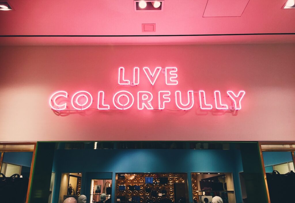
In today’s crowded marketplace, making a memorable impression is crucial. That’s where color comes in. A well-thought-out color scheme can make your brand instantly recognizable and convey its personality effectively. Think about it: Would Coca-Cola be as memorable without its iconic red? Or would Tiffany & Co. be as distinctive without its signature blue? The colors you choose can say a lot about your brand.
Practical Uses of Color Psychology in Design
The Art of Logo Creation
Your logo is often the first point of contact between your brand and potential customers. The colors you choose for it can set the tone for the entire brand experience. For example, red can evoke excitement and passion, making it a popular choice for brands that want to convey energy and dynamism.
Web and App Aesthetics
The color scheme of your website or app isn’t just about looking good; it’s about creating an environment that enhances user experience. A well-chosen palette can guide users through the interface, highlight important elements, and even influence user behavior. For instance, green is often used for call-to-action buttons to signify ‘go’ or encourage clicks.
The Power of Packaging
Imagine you’re strolling through a store. What makes you pick one product over another? Often, it’s the packaging that catches your eye. The colors used can evoke specific feelings or associations, influencing your purchase decision. For example, organic or eco-friendly products often use green to signify natural and sustainable.
Table: Guidelines for Applying Color Psychology
| Tips for Implementation | Detailed Explanation |
|---|---|
| Understand Your Audience | Cultural perceptions of color can vary |
| Experiment and Refine | Use A/B testing to optimize your color choices |
| Maintain Brand Consistency | Keep a uniform color scheme across all platforms |
Real-Life Success Stories
Brands like Apple, Google, and Nike have effectively leveraged color psychology to build a strong brand identity. They’ve gone beyond mere aesthetics to create an emotional connection with their audience. These brands serve as excellent examples of how understanding and applying color psychology can lead to business success.
The Evolving Landscape of Color Psychology
As technology advances, the role of color psychology is set to evolve. With the rise of virtual and augmented reality, brands have new platforms and dimensions to explore. The future holds exciting possibilities for how color psychology can be applied in these emerging spaces to create even more impactful brand experiences.
Final Thoughts
The influence of color psychology in brand identity and design is undeniable. It’s not just about choosing pretty colors; it’s about selecting hues that resonate with your target audience and convey your brand’s essence. So, the next time you embark on a branding or design project, remember to give color the attention it deserves. After all, the right shade could be the key to unlocking your brand’s full potential. What do you think?